 |
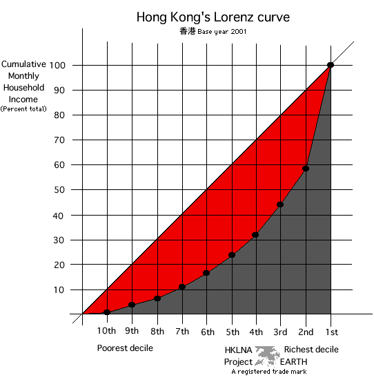
Graph 35e Visualizing the GINI Index The GINI index approximates the ratio of the area in red divided by the total area under the 45degree line -- namely, the sum of the red and gray areas. As the red area becomes larger income inequality increases. The red area becomes larger as income to poorer deciles decreases and income to larger, richer deciles increases. An online tutorial developed by Robert Rycroft about the Lorenz curve and GINI coefficient can be found at the Mary Washington College website. Caution: Using this tutorial requires a recent version of Shockwave Player. I was able to open it with Shockwave Player 8.0. You may download a free copy of verion 8.0 in the following languages: English, French, German, Japanese, and Korean. It is a great tool for viewing 3D and other animated webmaterial, as well. Unfortunately, as of 11 November 2002 a Chinese version was unavailable. |
| top |