Section four
Language and Society
Hong Kong's Neighbors
Greenberg's Diversity Index
Line and Pie Graphs Generated from Artificially Created Data
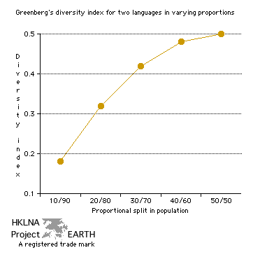
| Graph 74a - Greenberg's Diversity Index for
Two Languages in Varying Proportions. graph 27 graph 56 graph 74b graphs 75a and 75b graph table 27b collection index (graphs) |
 |
| Note 1: This is a graph of artificially generated data obtained by substituting values of P1 and P2 into the formula for calculating Greenberg's diversity index. The relationship between P1 and P2 is given by 1= P1 + P2. The values of P1 and P2 along the x-axis have been represented as whole number multiples of ten for ease of illustration. | |
| Note 2: As the
ratio P1
/ P2
becomes larger so too does the level of diversity. Thus, populations
with nearly equal representation are more diverse than those where one
language is dominated by another. This is because the chance of meeting
someone, who speaks a language different than one's own, increases with
more equal representation of both languages. The relationship between
the index and the ratio of representation P1 / P2 is
nearly direct up to the ratio 30/70. Thus, most of the
diversity is accounted for when 0.00 ≤ P1 / P2 ≤
0.40. |
|
| Source: Greenberg, Joseph H. 1956. The measurement of linguistic diversity. Language, vol. 32, 1, March. | |
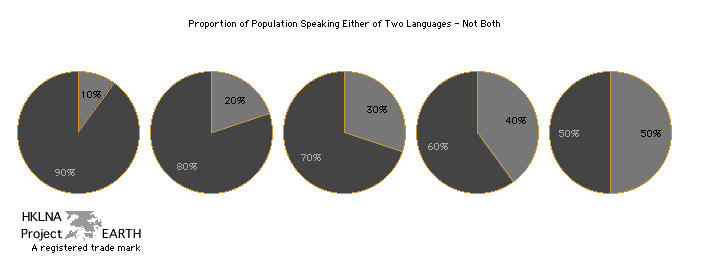
| Graph 74b - Pie graphs corresponding to
populations with two languages represented in different proportions. graph 27 | graph 51a | graph 52a | graph 55 | graph 56 | graph 74a | graph 75a and 75b | table 27b | collection index (graphs) |
 |
| Note: These pie graphs correspond
to the data illustrated in graph 74a
above. Each pie graphs represents a different distribution of any
two languages across different populations. |
| Source: See source and note entries for graph 74a above. |
| top |